Many people realize that using colored filters with black-and-white film will effect the way tones are rendered on the negative. For example, using a green colored filter will cause green objects to be rendered lighter than they otherwise would have been, giving the photographer a useful tool for separating tones that otherwise might come out too close.
One day last summer I aquired a free set of 3D glasses, with red and blue filters. The pass-band of these filters seems to be much narrower and sharper than that of filters sold for photographic purposes. This requires a great deal of extra exposure compensation and guesswork, but the tonal modification effect is very strong. Once I realized this, I sought out some colorful subjects to try to "max out" the effect.

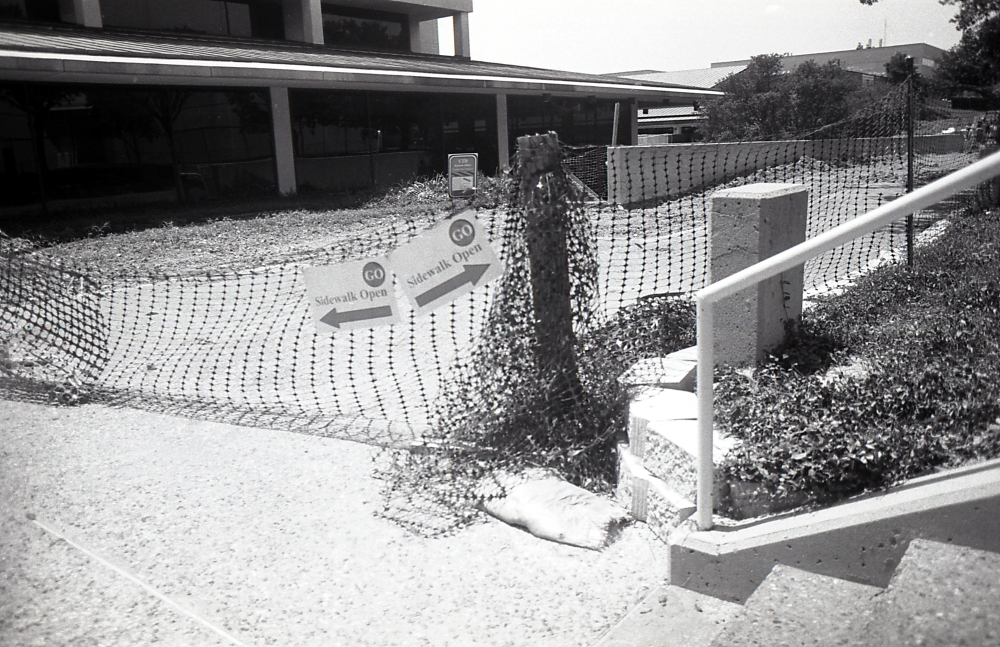


These photos are interesting to me because even though tones can be completely swapped between the two images, the effect is not as jarring as it should be. If I had used color film to capture the color images that were coming through the glasses, the difference would be extremely obvious. Or, if I did something like use digital editing to invert the colors of a color image, the effect would also be exteremely obvious.


On the other hand, the black-and-white negatives exposed behind each of these filters actually look rather similar to each other on first glance, despite originating from two very different color images. I actually had ought to post these images in the form of a mouseover-comparison for emphasis, because although one can logically locate a pair of tones in one image and compare them to the same tones in another image and realize they are completely different, a casual glance at both renderings gives the simple impression of two black and white pictures, with slightly different tones. Yet there is such extensive tonal modification going on, that elements can completely disappear from the pictures.
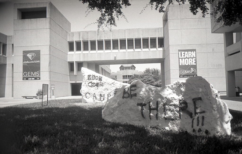
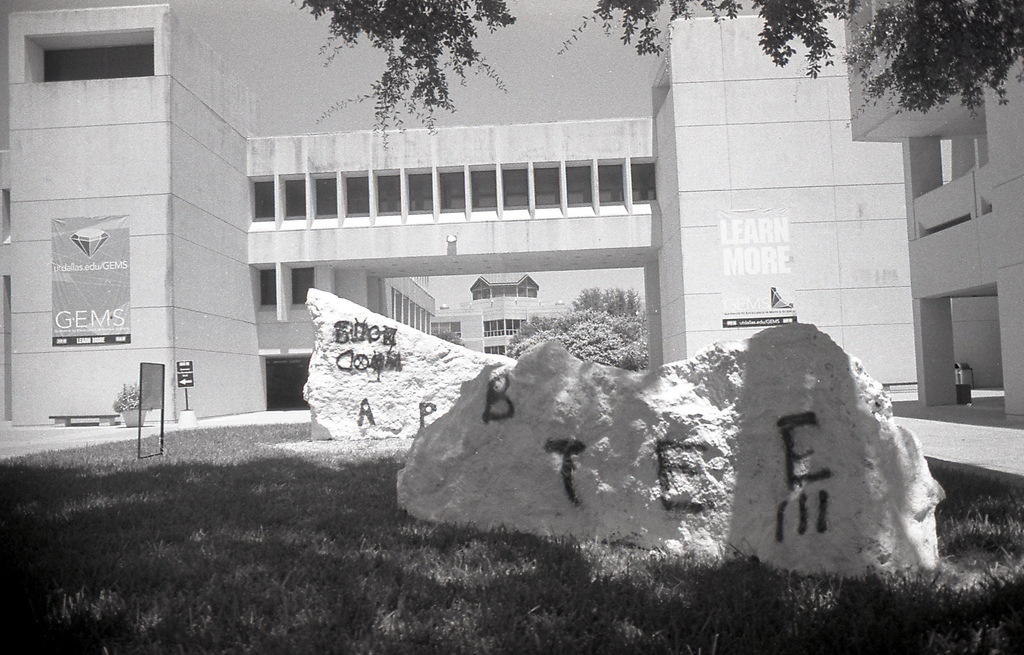
Our brain accepts a radical change in tone much more readily than a radical change in color. Which if you think about it, is no news considering the extent to which fine-art black-and-white prints are by necessity manipulated for tone, with black skies and white tree bark highlights and filtered skin tones. Somehow because the black-and-white image is less realistic, it looks more realistic, making it robust under manipulation and indeed requiring it.